Durban Poison
An Artists Next Chapter
Creative Direction / Product Design / Illustration / Promotional Material
Deliverables
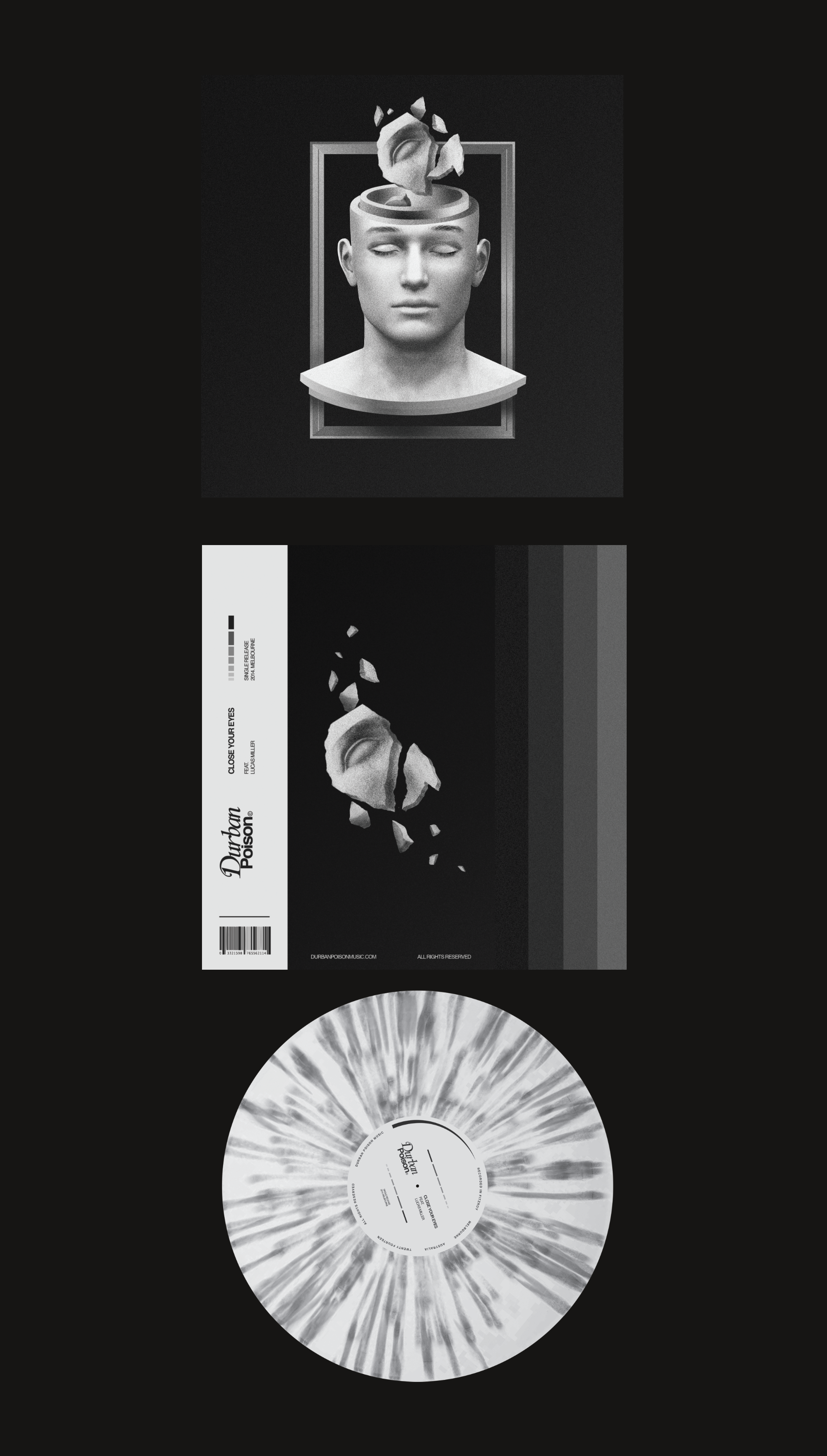
Durban Poison, an emerging producer based in Melbourne, lacked a digital presence or any visual identity that represented the essence of the brand. After experiencing the music and engaging with the artist, key themes began to emerge: ambiance, space, dreams, and peace of mind. These themes formed the foundation for developing a unique brand identity that truly reflected the artist’s sound and vision.
Opportunity
For the launch, Durban Poison released two singles—“Close Your Eyes” and “Eye to Eye”—each with its own distinct sound, requiring unique artwork. However, by ensuring the back covers and merchandise were aligned, we were able to craft a cohesive brand identity that tied the project together seamlessly. The artwork itself needed to evoke optimism while conveying a sense of space and calm. To achieve this, we used expressionless faces and floating objects, capturing a zen-like atmosphere that reflected the tranquil, dream-like quality of the music.
Outcome